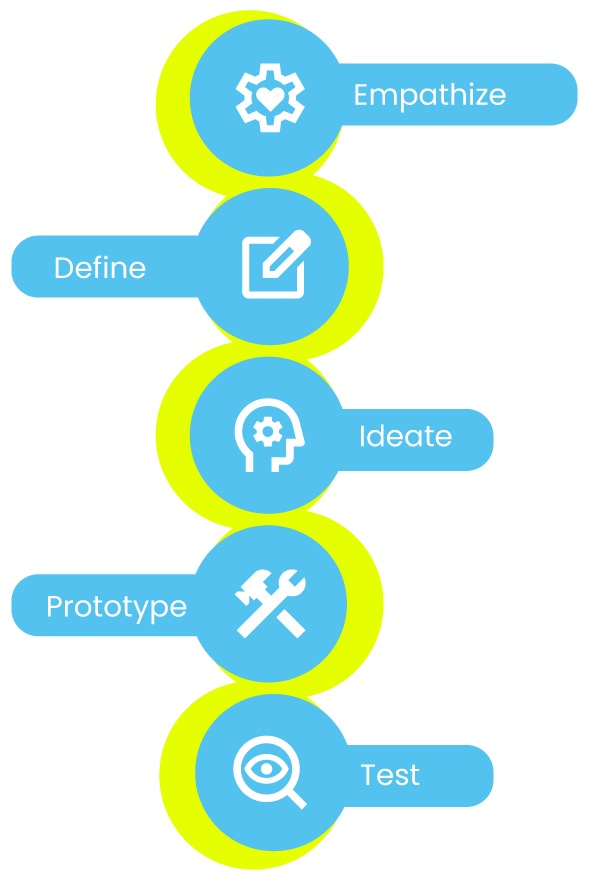


Empathize
Define
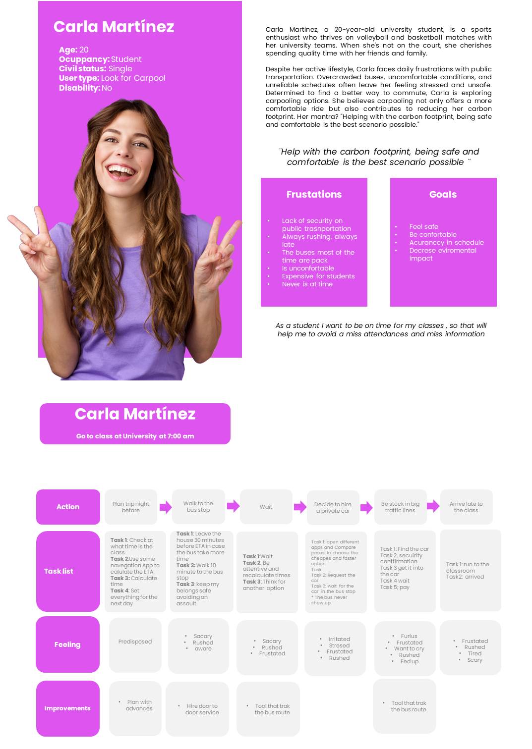
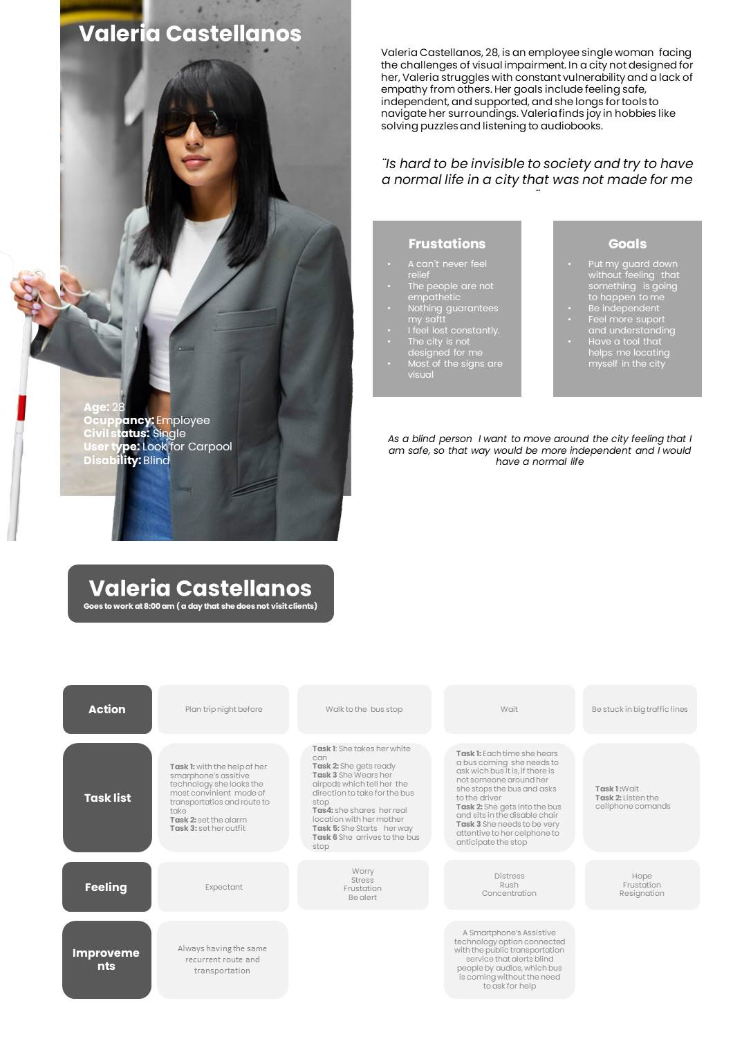
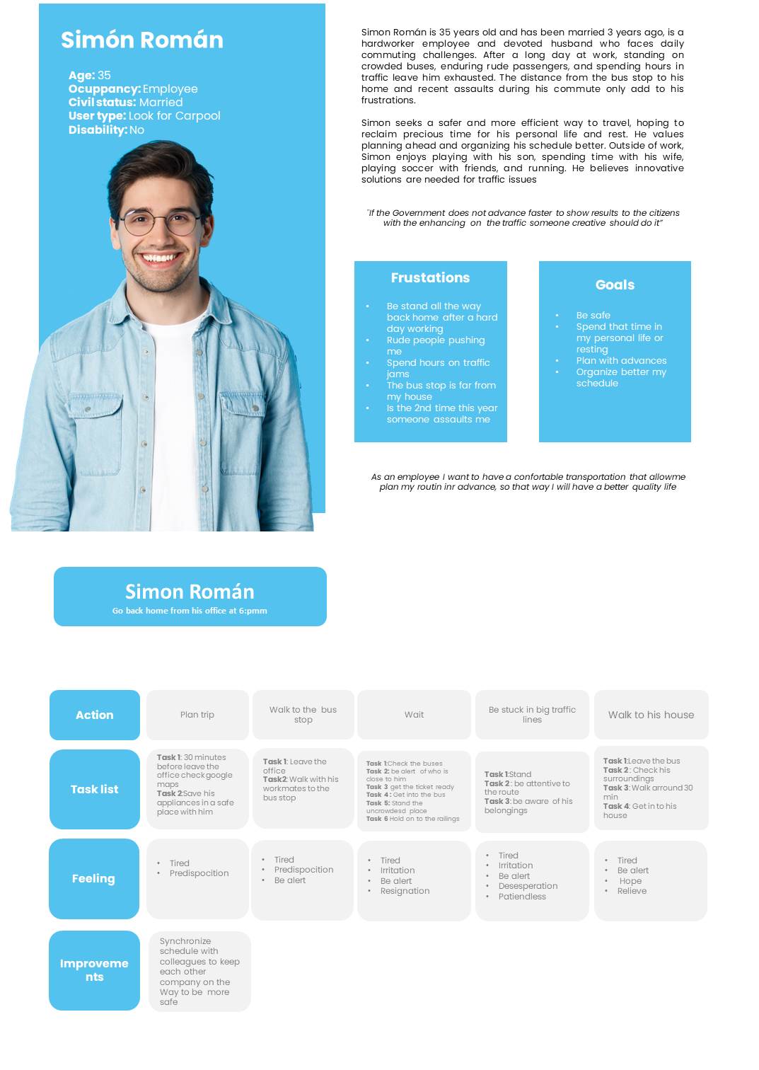
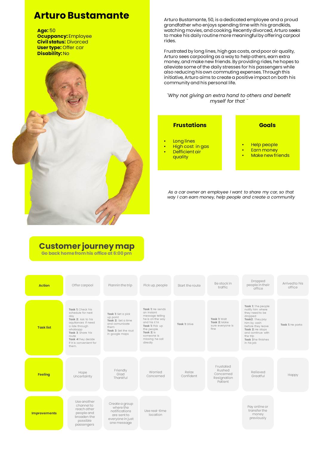
Users persona and customer journey map
Hypothesis statement
At the moment users download the carpool app, they will have a higher chance of being safe, happy, and enjoying a better lifestyle by sharing rides with other people. We believe that a carpool app will provide users with more comfort, security, and less time spent on transportation in their daily routines.
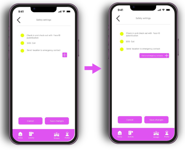
• Real time tracking (Security).
• SOS button (Security).
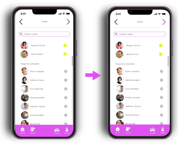
• Customize groups.
• Create recurrent groups.
• Rates and reviews.
• Different payment methods.
• Have a private spot.
• Booking in advance.
• Automatic reminders.
Ideate
AI
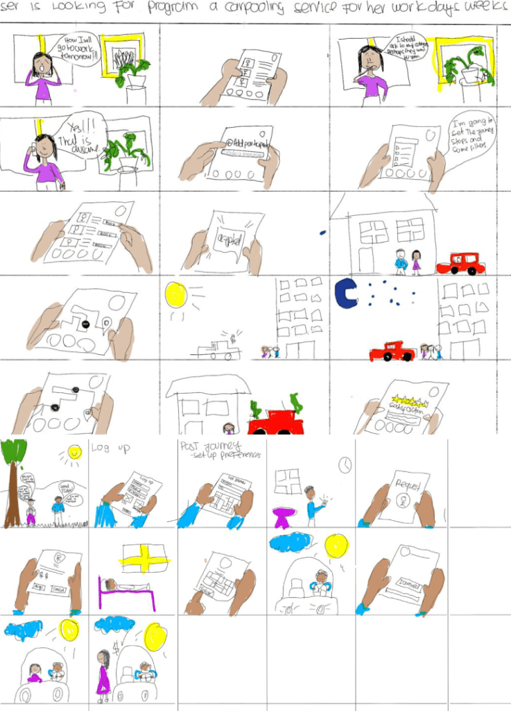
Story Board
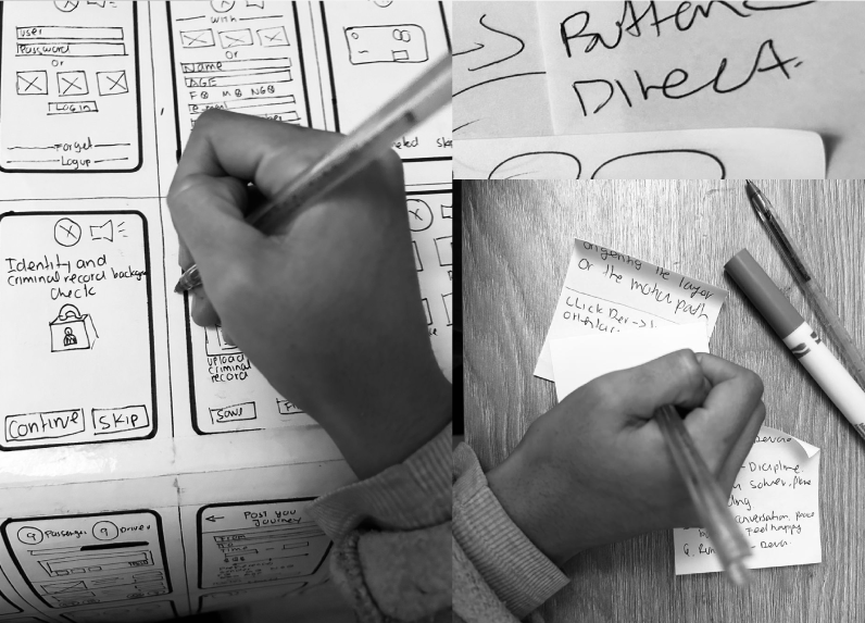
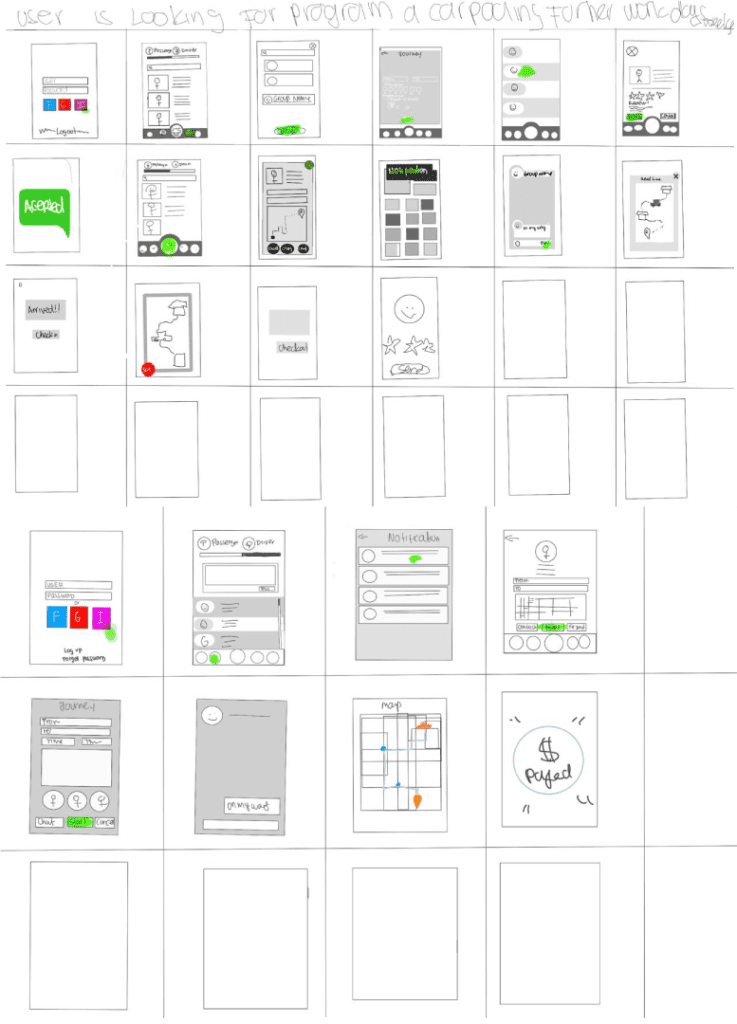
Sketching
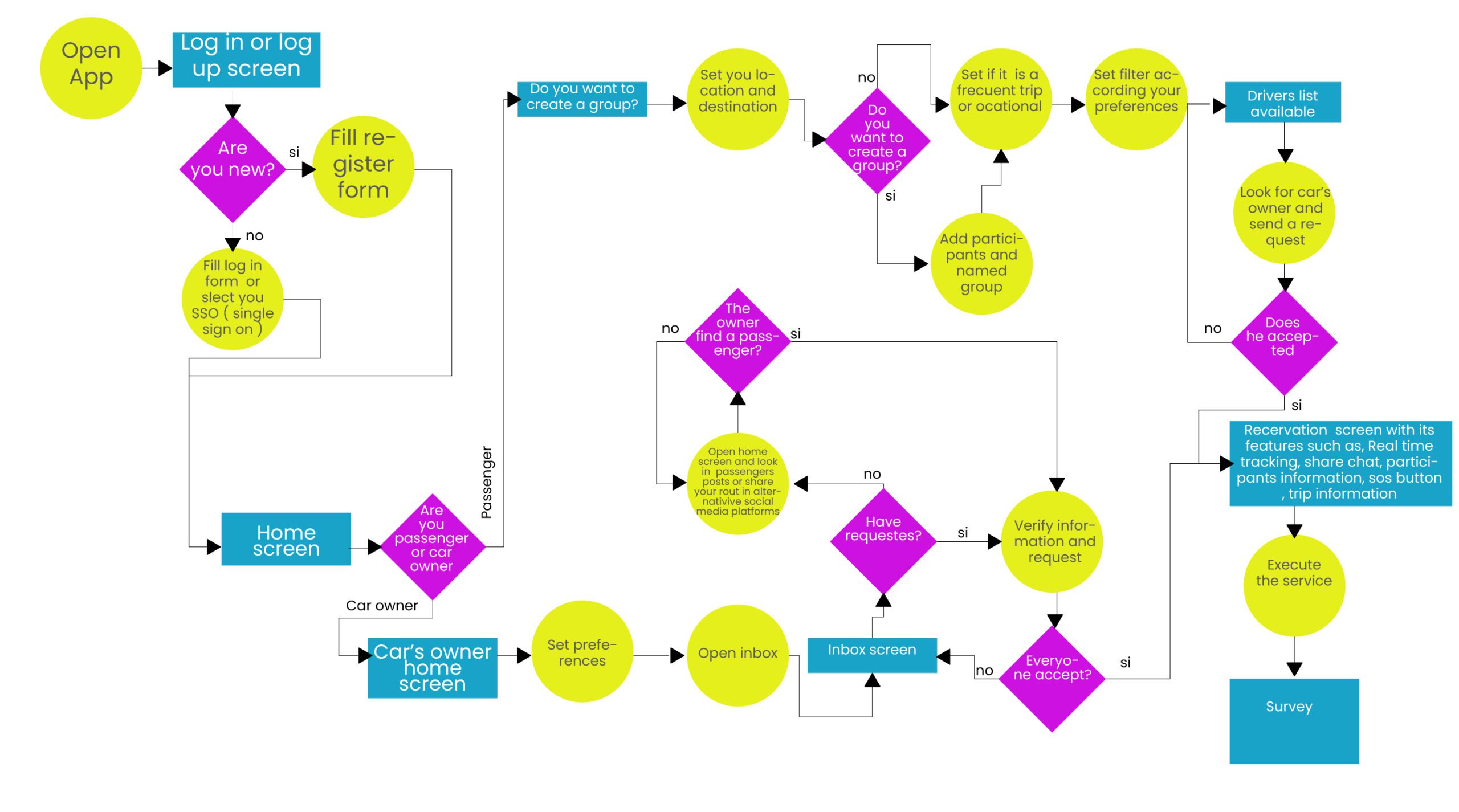
User flow
User story board
Sketching
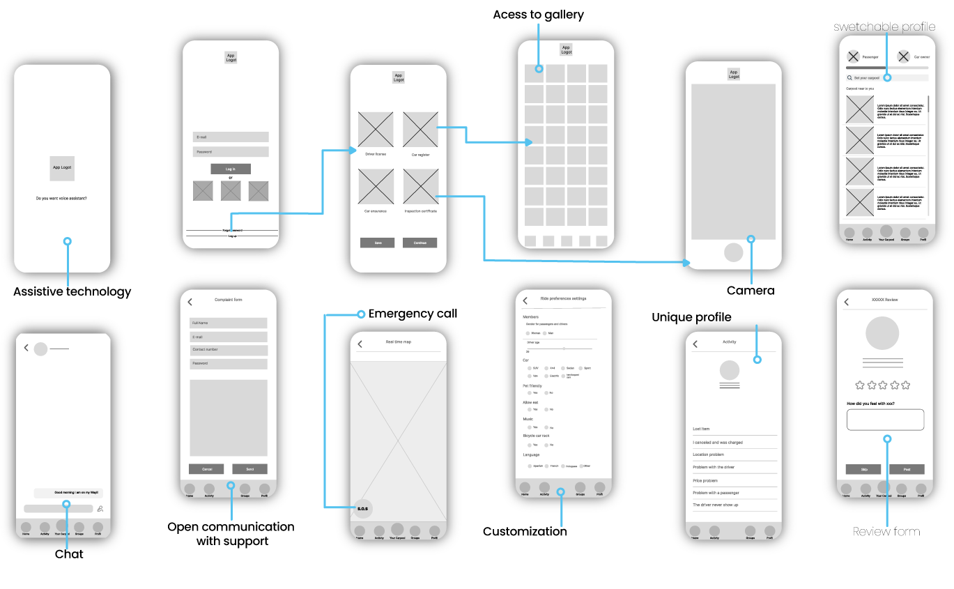
Wireframes
Prototyping
Low-Fi
After reviewing the user preferences, sketches, and AI, I finalized the Lo-Fi digital wireframes that contemplated all the screens and their functionality. One of the biggest challenges we faced was realizing that I needed to add more features than originally planned to provide users with a smoother experience within the app.
Hi-Fi prototype
Testing
Project Background:
People face challenges moving around the city, impacting their finances, security, and comfort. This project aims to address these issues by ensuring easy navigation, effective information architecture, and a user-friendly experience to help users book a carpool service successfully.
Testing Goals:
• Assess the clarity of the app’s navigation.
• Ensure the app includes all necessary elements for users to complete tasks.
• Verify the functionality of each element.
Research task
1. Create a new account by uploading the required documents.
2. Create a new group.
3. Book a trip.
4. Review your previous trips.
5. Add a new payment method.
6. Add an emergency contact to your trips.
7. Switch your profile from passenger to driver.
8. Post your trip to the community.
9. Accept a request.
10. Check your available funds.
11. Chat with the group about your trip.
12. Cancel the trip.
13. Switch back to the passenger profile.
14. Leave a review for the driver.
Methodology
• Moderated usability study
• Location: Colombia.
Participants
• Students, employees between 18-60 years old.
Insights and Design Iteration
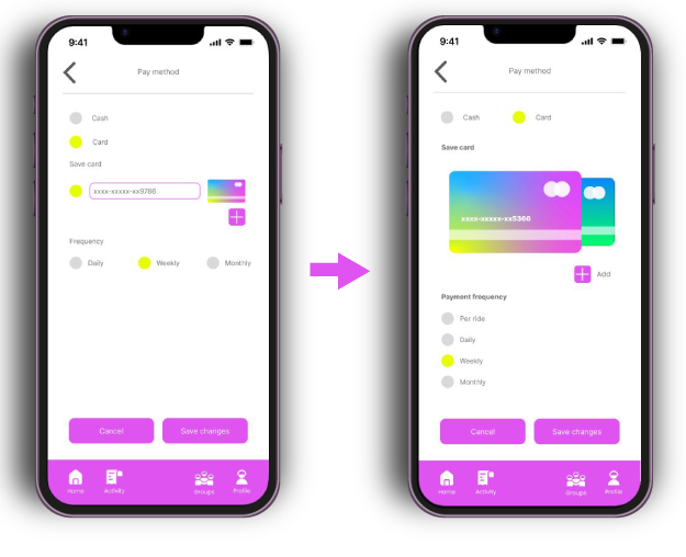
Button Visibility:
Some buttons were not perceived as interactive elements
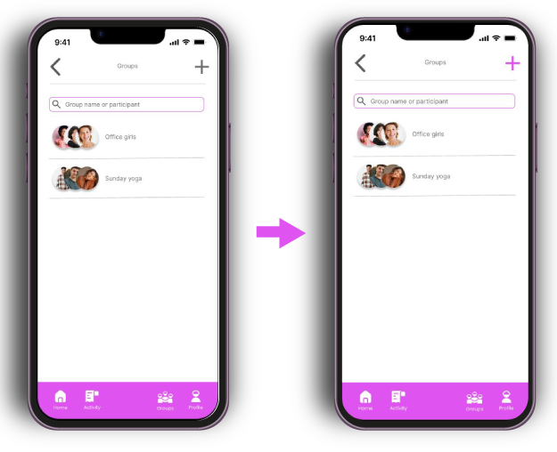
Profile Switch Bar:
The profile switch bar did not clearly indicate the swipe action.
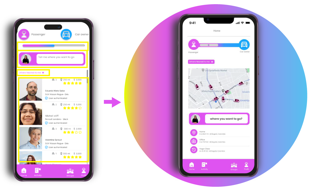
Overloaded home:
The home screen was overloaded and did not display the most relevant information for users initially.
Driver List Distraction:
The driver list on the home screen distracted users.
Ambiguous Copy:
The text was ambiguous and lacked clarity.
Unclear Commands:
Some commands were not easily understood.
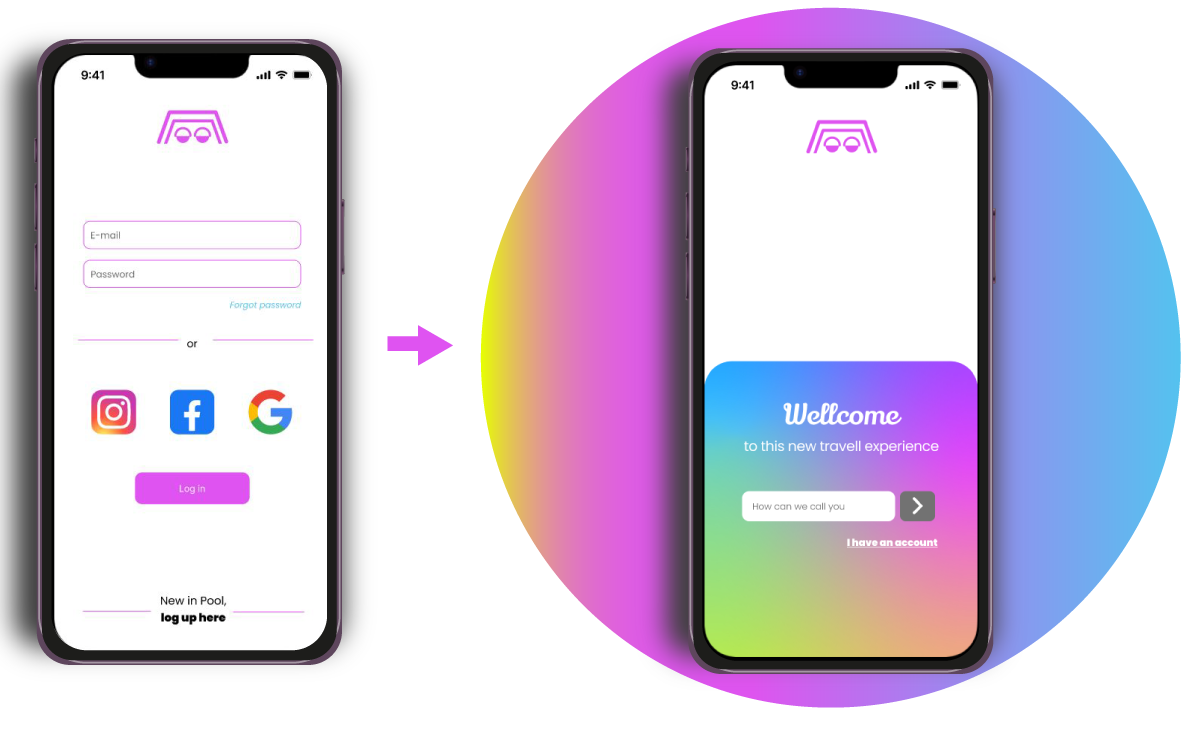
Uninspiring Register Button:
The register button did not call to action effectively.
Take aways
Understanding user needs through regular feedback is essential for aligning the design with user expectations. It is crucial to ensure that commands and interface elements are clear and intuitive. Menus should be simplified and prioritized to prevent overwhelming users.
Effective communication with precise language helps guide users and avoid confusion. Visual design should make interactive elements distinct and easy to use. Features that boost user engagement and action are important for a successful design. Continuous iteration based on user feedback is necessary for ongoing improvement. Additionally, integrating and highlighting safety features prominently is critical for user trust and security.
I feel proud of the work I’ve done and continue to do; however, every project is a new opportunity to learn new tools and enhance my skills. See you soon in the next project!