


Methodology
I chose the Lean UX methodology for this project because it combines design thinking, user-centered design, agile development, and continuous iterative improvement, allowing us to test the product in real market conditions and situations.
Constraints
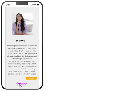
The biggest constraint I faced in this project was the implementation of the methodology, which requires constant teamwork to enrich and grow the project from different knowledge perspectives based on the team’s expertise in their fields. However, I experienced a lack of workforce to collaborate with. While the methodology advocates for diverse and cross-functional collaboration, my team consisted solely of the company owner, who is responsible for developing sessions with her customers (she is a physiotherapist) and managing the company. Another difficulty was her limited schedule, as she had to oversee both the company and her customers.
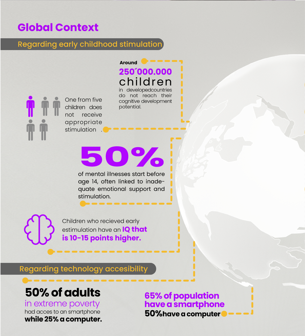
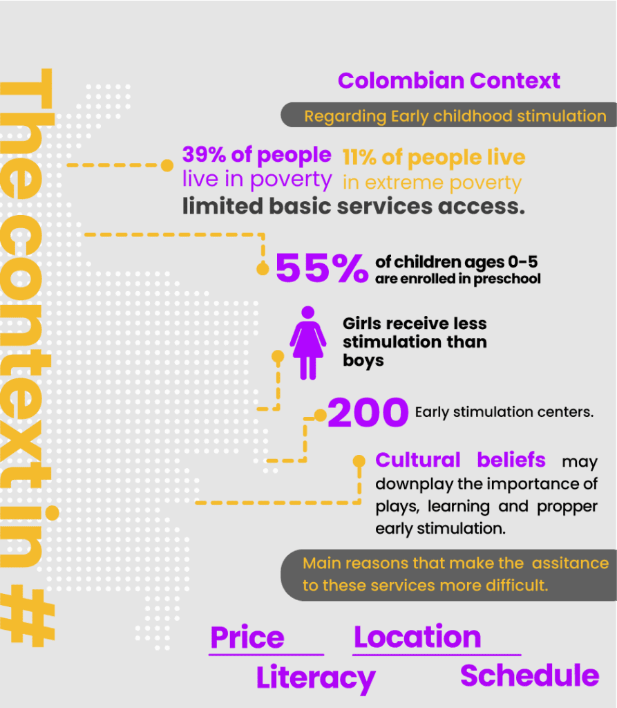
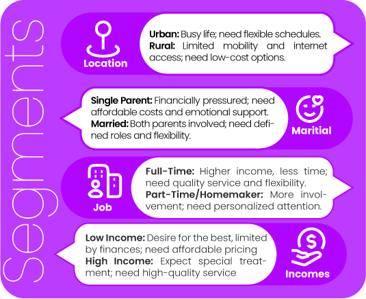
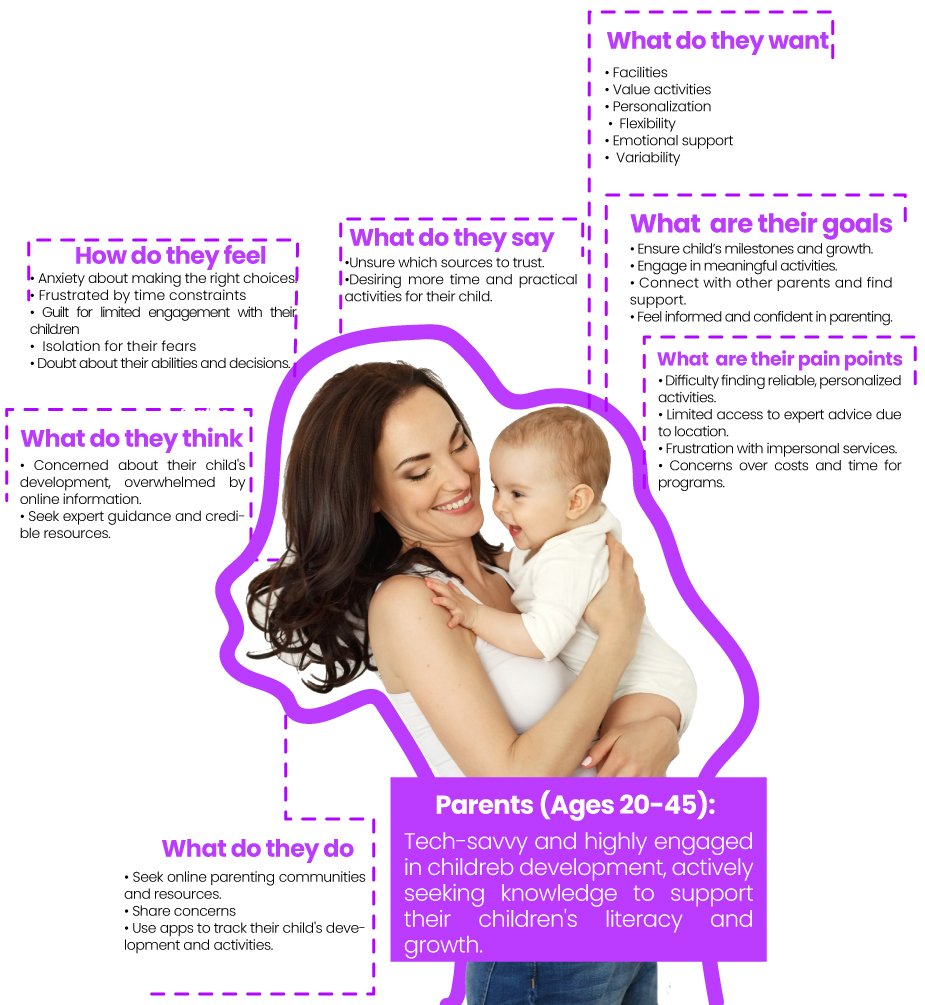
Target user
Research
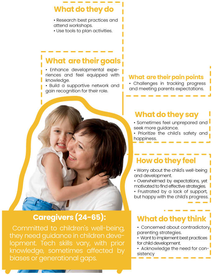
Target user
Research
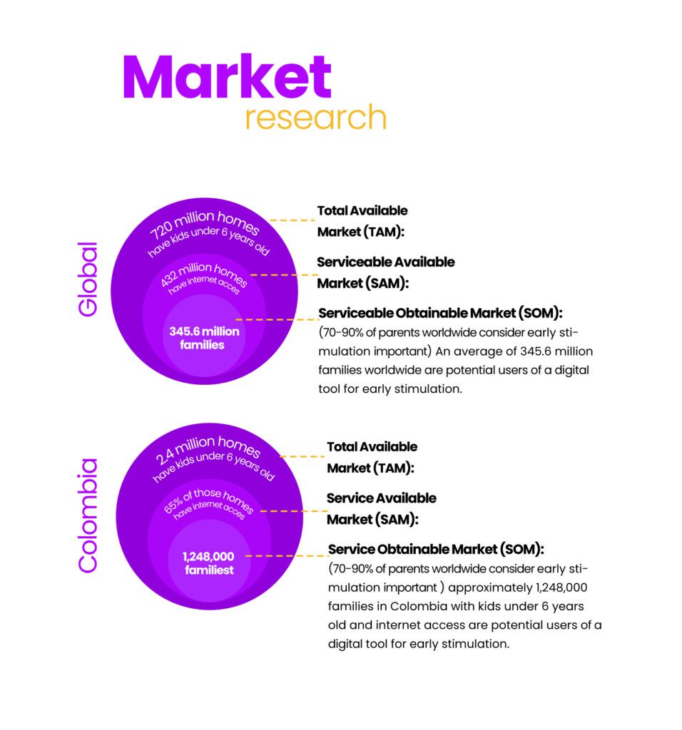
Market
Research
Competitive analysis
Most common strengths
User-Friendly
Varied Activities:
Informative Resources
Most common strengths
Lack of Multimedia
Vague Diagnostics
Limited Personal Contact
Limited target
Most common strengths
Tradictional centers
Online free content
Screen fatigue
Most common strengths
Technology Integration
Emotional Relationship Audience Expansion
Improved Accessibility
“Everything starts with an hypothesis”
Lean UX
Outcomes
• A new business model
• Creation of a new digital service
• Partnership with an ambassador to represent Gabriela Rojas in different cities and countries
• Alliances with schools, pediatricians, etc.
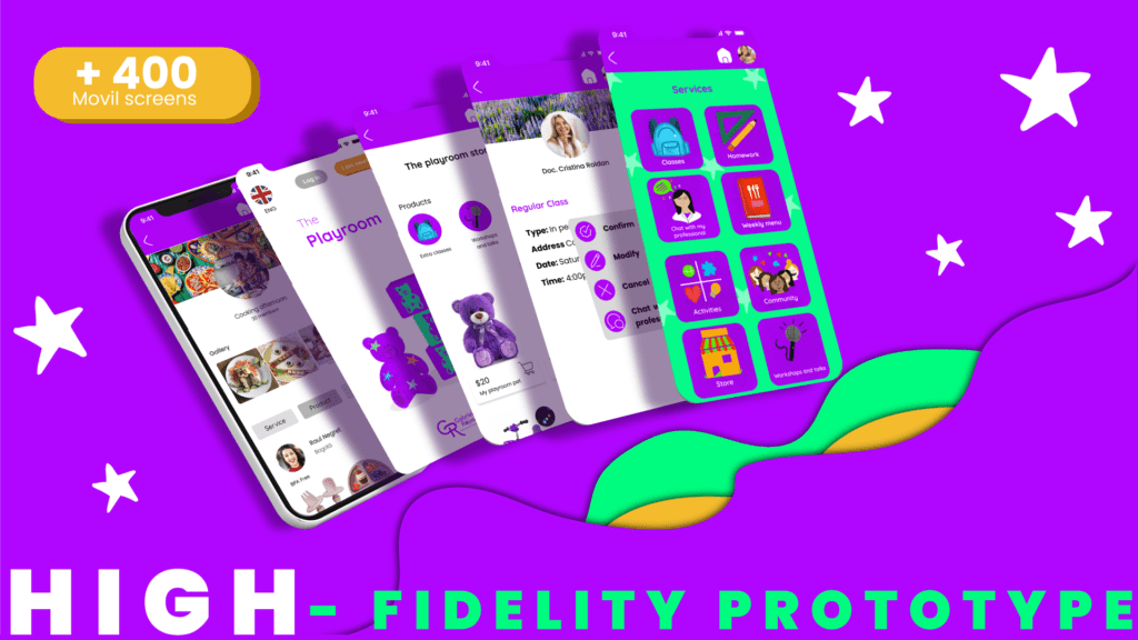
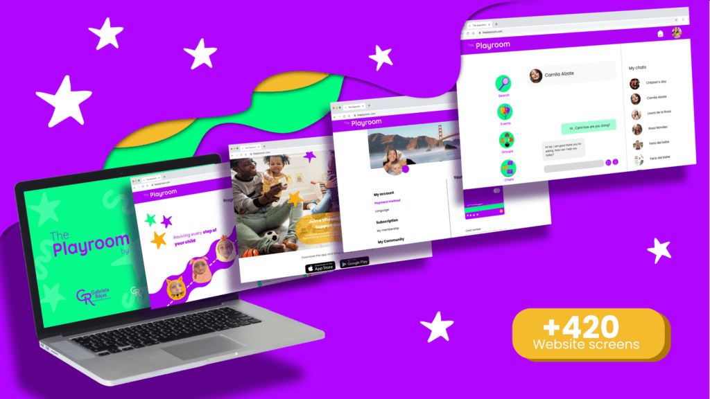
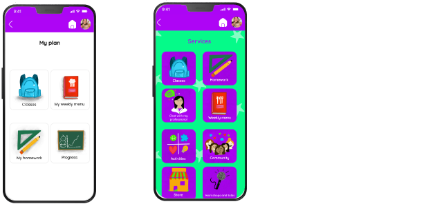
• A mobile and web platform
Outcomes
• Videos
• Chat
• Videos
• Chat
• Video calls
•Personalized development plans•Gamification•Administrative processes
•Offline accessibility
•Notifications
•Special courses
•Progress tracking
•Q&A section
•Language options
• Weekly menu
• Daily activities
•Community
“We believe that this digital product and its features will empower parents to make informed decisions, ease their parenting experience, alleviate feelings of guilt, increase client numbers, expand our approach to other countries and cities, and ultimately enhance the development of more children worldwide by providing early stimulation and comprehensive support for optimal results.”
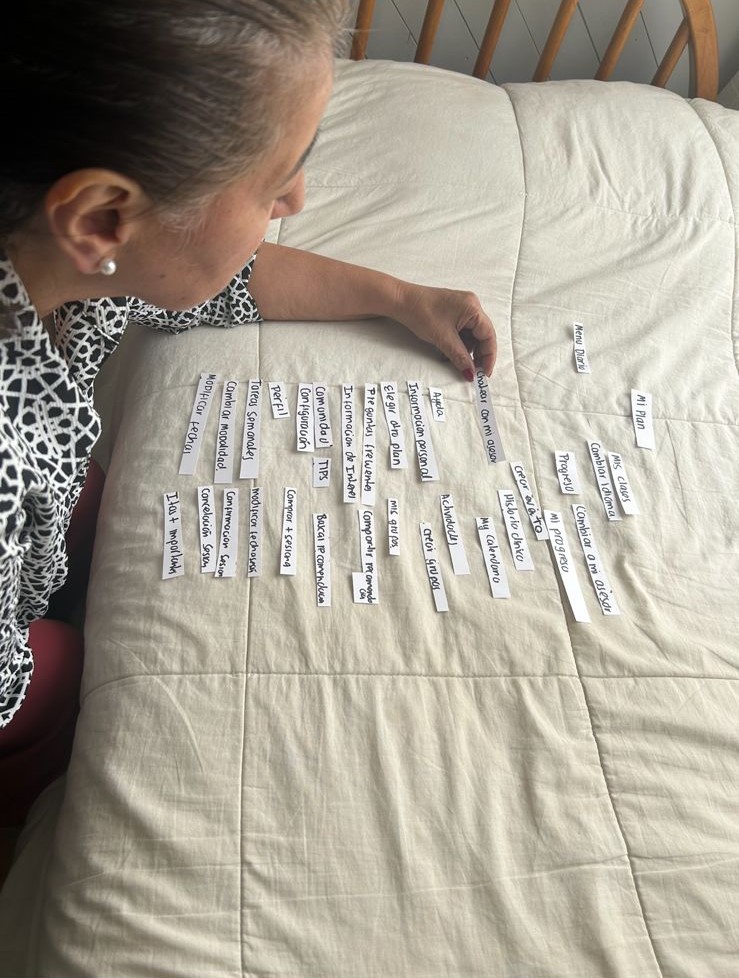
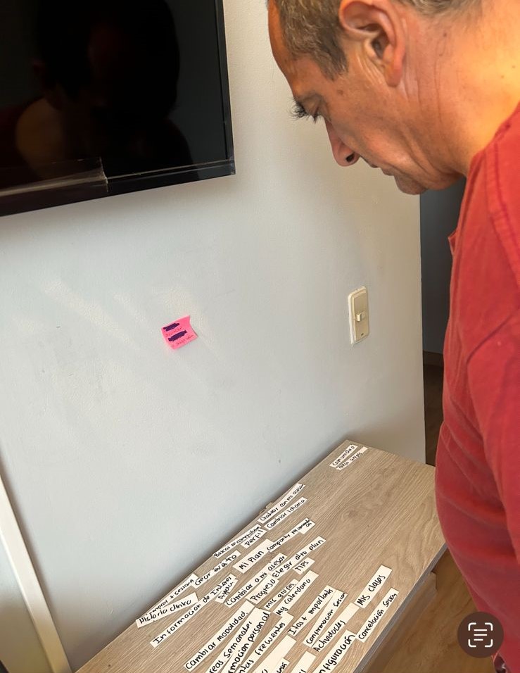
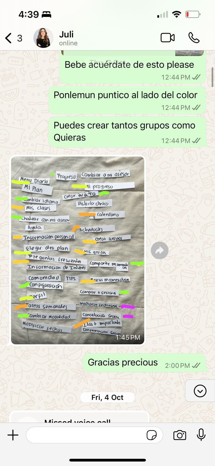
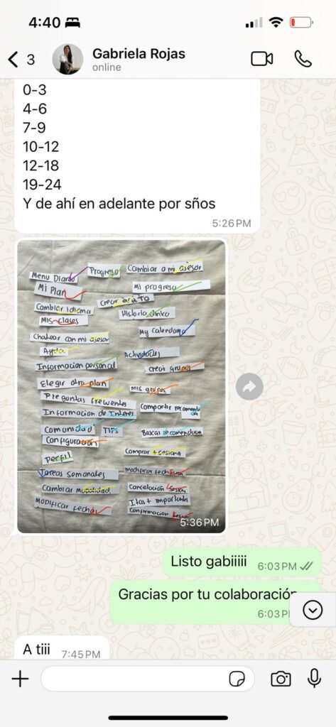
Card sorting
Distance-In person
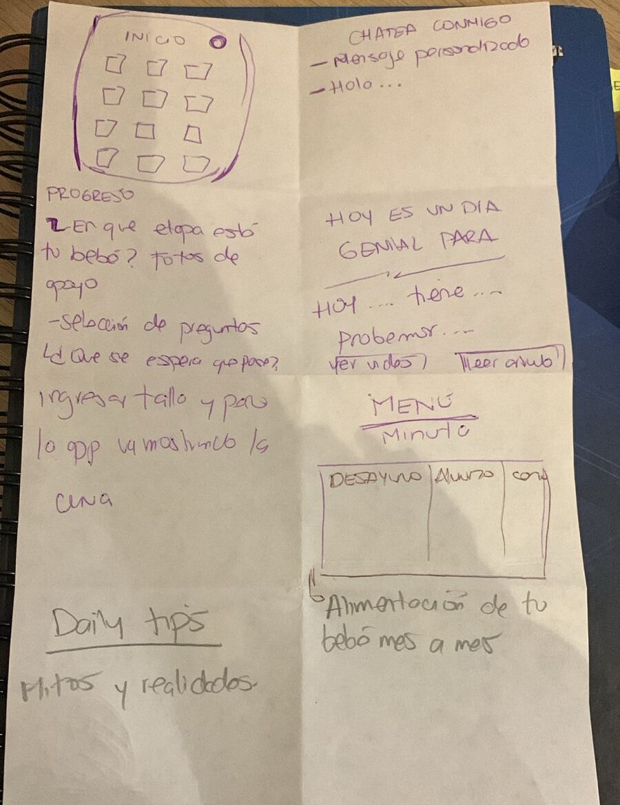
Sketching
Design studio ideation activity
virtual sessions
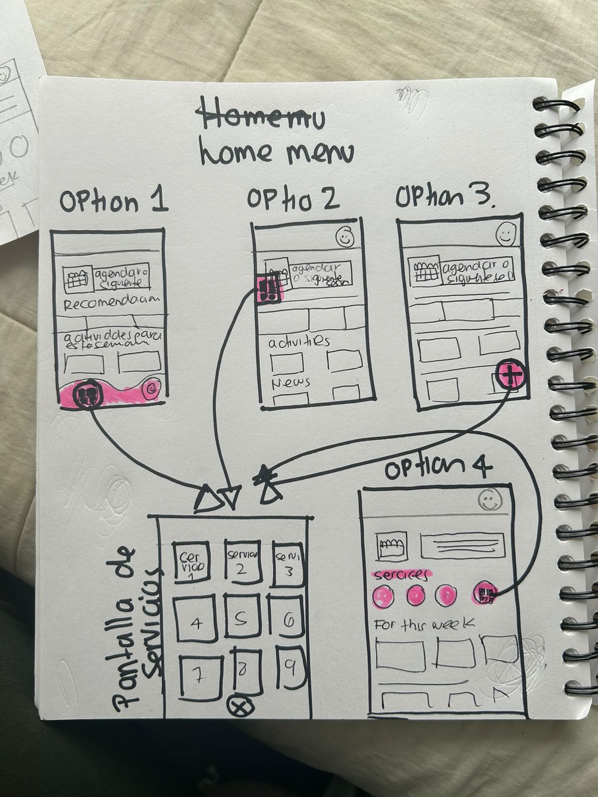
User flow
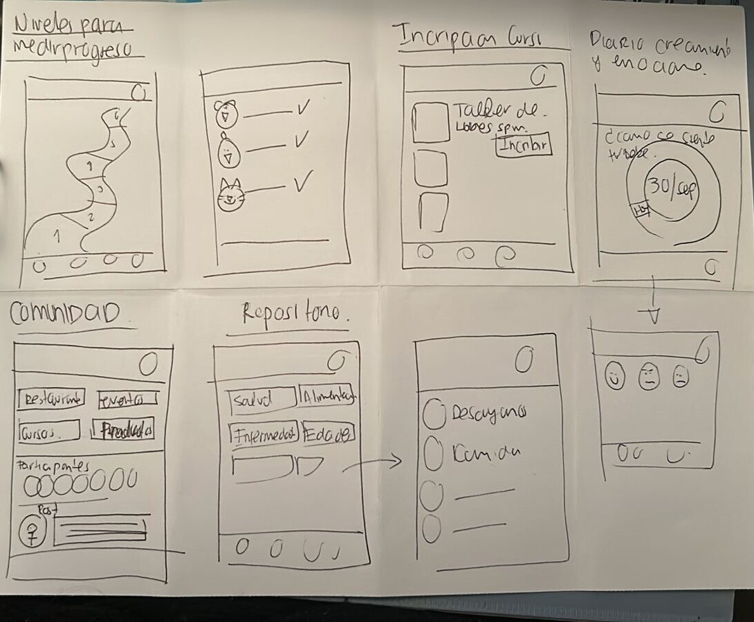
Sketching wireframes
Prototyping
Lo-Fi
After analyzing user preferences, early test results, sketches, and user flow insights, I created Lo-Fi digital wireframes that covered all screens and functionalities. Along the way, I had to adjust the user flow to simplify navigation and make the app easier to use.
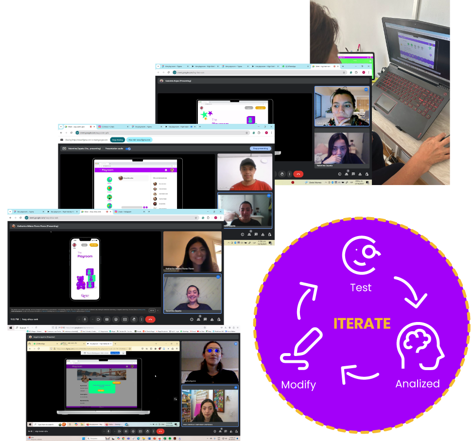
User test
Goal
Test the ease of navigation.
Test its intuitivness.
Test its featuresʼ understandability.
Users
Parents between 28-35 years old.
Caregivers betwen 25 -55 years old.
Task
1. Creation, password recovery and profile modification.
2. Menu edition, assigned tasks, contact with professionals, questions about development.
3. Choose activities, photo upload, development stages, medical updates.
4. Schedule, change, cancel, confirm appoinments, scheduling classes
5. Explore and share in groups, talks registration, event planning.
6. Buy articles and events, points usage, add a credit card, purchase complaints.
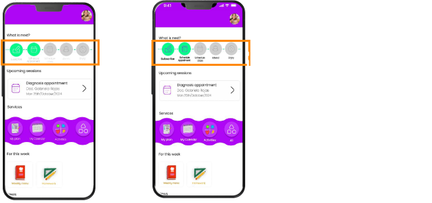
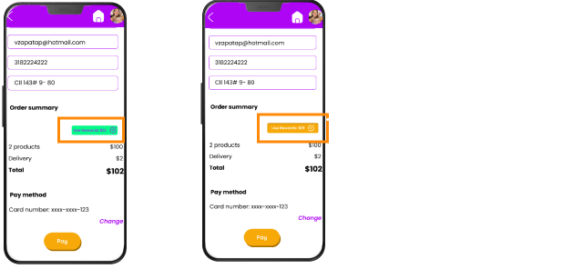
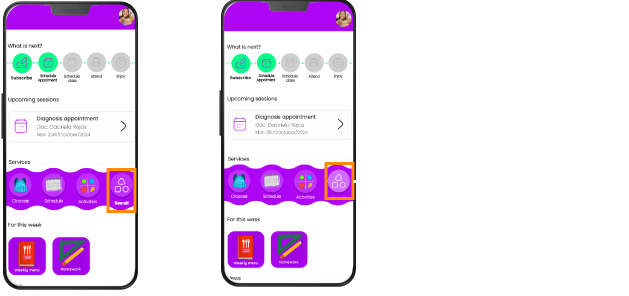
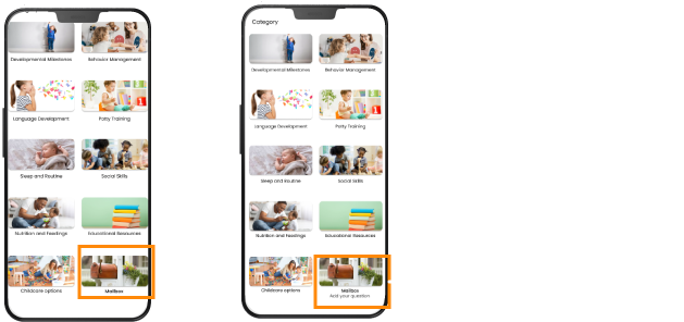
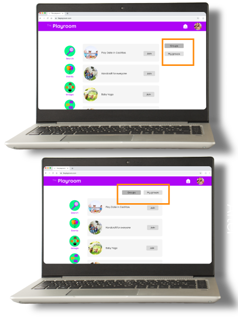
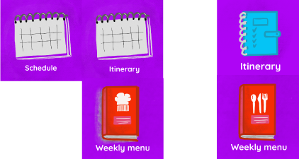
Before
After
Before
After
Before
After
It was changed to provide clearer information regarding the functionality and what users can find in the feature through a more accurate illustration.
What is next?
The next steps involve refining user interactions through additional usability testing to improve navigation and accessibility. If the project moves forward with coding and development, close collaboration with the development team will ensure that each feature and interaction is implemented as intended, supported by comprehensive documentation. Lastly, a scalability plan focused on communication and marketing will be essential to increase platform visibility and reach, positioning it effectively to attract and engage new users.
Learning
The product should start with fewer features to ensure the quality of each one, placing a strong emphasis on user testing. This approach would also allow for better management of time and effort. In conclusion, during this phase, we could launch the project with a minimal set of features and progressively add more as it gains traction in the market.
Problem: This project addresses the need to expand and improve access to child development services.
Solution: A mobile and web app offering features such as classes with professionals, milestone tracking, personalized plans, daily activities, and a supportive community.
User Needs: Parents and caregivers seek guidance, reliable resources, and emotional support to confidently support child development, while caregivers also desire tools and training to meet parental expectations.
Features
An accessible platform with multimedia support, tailored plans, chat with specialists, reminders, and activity tracking, as well as emotional connection through direct professional support and long-term guidance, all accessible from any location or schedule.
Impact: This solution empowers families to confidently engage in their child’s development, addressing doubts and enhancing parenting experiences, while building bonds between therapists and families.
Conclusion: The tech solution aims not only to solve the company’s service reach and diversification challenges but also to empower parents to enjoy the parenting journey without fear or doubt, creating a positive impact on the lives of children and families.